Labels

Wednesday 31 January 2018

Time Travel in Love


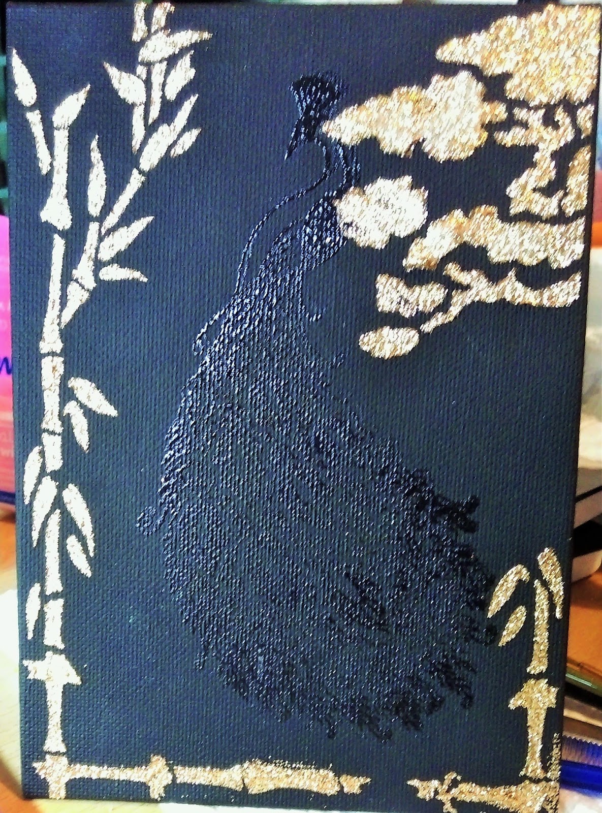
Hi there, welcome to my blog  :)  I have a card to share with you today that I made for my husband last week, for our anniversary.  I have used stamps from Andy Skinner, Indigo Blue and Visible Image; dies from Sheena Douglass; Distress Oxide  inks, Distress Inks, gold and silver gilding waxes.


I began with a piece of white card.  I put three contrasting colours of DOs onto my glass mat and spritzed them with water, then dragged the card over them.  The colours blend themselves together on the card.


Once the inks were dry I used the corresponding colours of Distress Inks to stamp images randomly over the card, adding Vintage Photo to stamp the clock.  


I then took a white base card and stamped the images again with the DIs randomly around the edges of the card to create a border.  I blended one of the colours around the outer edges to soften and shade the images.


Next I die cut several images from black card and used gold and silver gilding waxes to colour them.
I then edged the background panel with a gold pen and matted it onto black card.  I attached the panel to the base card and added the die cuts.  I stamped a sentiment onto a piece of spare background card using Sepia Versafine ink, and highlighted the words with gold pen.  I then edged the panel with gold pen and matted it onto black card to match the background panel.  I attached it to the card with dimensional glue, then die cut some anniversary words from black card, gilded them and attached them below the sentiment panel.


I had a ball creating this card, luckily my husband likes it too!  I used stamps and dies that I haven't used for a while, and of course my lovely DOs and DIs.  The sentiment has special meaning to us so I was delighted when Visible Image brought it out.  This is a great design for a man card but I'm sure a lot of women would like to receive it too, perhaps with a slight colour change.  It will suit a lot of occasions too.
Thank you very much for visiting my blog today, I hope you've enjoyed this post, feel free to browse a few more and I hope you'll come back soon  :) 

Tuesday 30 January 2018

Deep Sea Wonder


Hi and a warm welcome to my blog  :)  I am going underwater with you today, sharing one of my samples from the Chocolate Baroque shows in December featuring the lovely Seaside stamps.  I have used stamps from the Underwater, Mermaid Queen and Ammonite sets; Distress Crayons, white embossing powder, alcohol pens, Distress Inks, gold pen.


I began by taking a piece of Kraft card then stamping and embossing the Ammonite in white powder.  I partially coloured the image with a brown alcohol pen, letting the card colour show through.  I then masked the image, stamping and embossing two other images either side and slightly on top of the Ammonite.  I then masked those images.


To create the background I scribbled Distress Crayons randomly all over the Kraft card, then I blended the colours with a little water on my finger.  I used colours that I thought would represent the sea, and the application gives a shimmering effect.  


I removed the masks and coloured the images with DIs and water, adding some colour to the bottom of the panel for the sea bed.


I added gold pen around the edges of the panel, matted it onto navy card and attached that to a white base card.  I blended DI around the edges of the card then made a sentiment panel.  I stamped and embossed a sentiment in white onto some Kraft card.  I then used a couple of the crayons to add colour and edged it with gold pen.  I then matted it onto navy card and attached it to the card.


I really enjoyed creating this design, using these beautiful stamps and playing with mixed media which I LOVE!  The colours have helped me create the design and effects that I wanted, I am so pleased with the result.  This card is suitable for a lot of occasions and for any recipient.
Thank you for popping by my blog today, I hope you have enjoyed this post - feel free to leave me a comment, and I hope you'll be back soon  :)

Sunday 21 January 2018

Frank's Day Out


Hello and welcome to my blog  :)  I have a recent sample to share with you today that I created for the Chocolate Baroque Seaside shows in December.  These gorgeous stamps were a delight to work with - they really took me away from the frantic countdown to Christmas!  I have used stamps from the Seaside Dreams and Seashore Scenes sets; colouring pencils, Sepia Versafine ink, Vintage Photo Distress ink and gold marker pen.


I took a piece of Neenah Dessert Storm card to create my focal panel on.  I love Kraft card and this card is especially for inks, alcohol pens, colouring pencils and crayons, which I also love!  I wanted a Vintage postcard effect so I decided to use pencils.  I stamped several images from the Seaside Scenes set to create a scene using Sepia ink.  Not only does the Sepia ink look really good on this card, it helps to create the Vintage effect.  


I love colouring so this next bit was a joy to do.  It doesn't matter where you start but I like to start by colouring the main focal image first, in this case the lighthouse.  I decided to use the colour of the card as the colour of the stone that the lighthouse was made of.  Chocolate Baroque stamps always have an indication of where the shading is so I added a slightly darker tone than the card colour as shading.  As the sun is already positioned in the picture it is easy to see which direction the light is coming from.


I then coloured the background.  I wanted to create a beautiful sunrise/sunset scene on a lovely warm summer day, so I coloured the sun and rays with several shades of yellow and orange, adding them to the blue sky too.  The colours are quite muted because I'm using Kraft card, but it helps to create the Vintage postcard look too.  I used the colour of the card for the sand too.  


I took a white base card and stamped the shells from the Seaside dreams set.  I stamped them with DI along the top edge of the card and used water and a small brush to drag the ink out and semi colour them.  I wanted the shells to look natural and resemble an old sepia photo.  I did the same along the bottom of the card.


I stamped a sentiment 'in the sand' and added the seagull in the bottom corner.  I coloured him in with the pencils - he's called Frank by the way.  I added gold pen around the edges of the panel and matted it onto dark brown card.  I then added it to the base card.


I absolutely love this card!  The result is just as I wanted - an old, Vintage Seaside postcard.  The sun is shining, the sails are billowing, and Frank is enjoying the view from the beach!  This card would suit any occasion, and recipients of any age would instantly be transported to a lovely day at the beach.
Thank you very much for dropping by today, I hope you have enjoyed this post, and that you will pop in again soon  :) 


Country Dolls


Hi and welcome to my blog  :)  I have an 'oldy but goody'  card to share with you today, it's a sample that I made it some time ago for Chocolate Baroque's Russian Shows.  I have used stamps from the Babushka, Silhouette Palaces, Large Crackle, Words to Dazzle and Sparkle and Magical Landscapes sets; Aqua Tint Perfectly Primary paints, Distress Inks, black Versafine ink.


I began by stamping a set of Russian dolls onto white card using black ink.  I masked the images  then drew a large circle on the card and masked that.  I painted the background and sky next, adding hills in the background.


I removed the mask from the circle and painted it yellow for the sun, then I stamped a Silhouette Palace in black ink and some trees in the background.  I stamped some clouds in the sky and faux bleached them then added some more clouds freehand.


 I used a stencil from my stash to add a large tree in the foreground to the side of the picture.  I really like the way it frames the scene, and the way the branch goes across the moon.  I then removed the masks from the dolls and painted them with DI's.


I took the crackle stamp and stamped it in black all around the edges of a white base card.  I then matted the focal panel onto black card and attached it to the base card.  I stamped a sentiment onto some white card using black ink and embossed it in clear powder.  I die cut the sentiment and added ink while the die was still on the card, using it as a stencil.  I then removed the die and added more ink to the outer edges of the panel and attached it to the card with dimensional glue.


I really love the simplicity and bright colours of this card, I think it works well as a design.  I wanted  this design to have a very rural and rustic feel to it.  This card would suit most occasions and recipients, it would certainly make a bright and cheerful gift!
Thank you so much for dropping in today, I hope that you've enjoyed this post and will pop in again soon  :)

Saturday 20 January 2018

A Sign of Spring


Hello and welcome to my blog  :)   I have a mixed media canvass to share with you today, one of my samples for Chocolate Baroque's tv shows.  I have used stamps from the Lilly, Hyacinth and Breath of Spring sets; acrylic paints, black Versafine ink, liquid pearls, and Pebeo acrylics.


I started by stamping the Hyacinth several times onto the canvass using black Versafine.  I stamped two images and masked them, then stamped a third and masked it.  I then painted the whole canvass with blue acrylic, when it was dry I sponged silver paint all over to add more texture.


When the paint was dry I stamped several silhouette stamps around the flowers using black ink, and embossed the images with clear powder. 


I removed the masks and started to paint the flowers in the folk art style.  I used lilac and white acrylic and a small round brush which I double dipped in the paints.  That means that I dipped the brush into both colours, the colour that I dip into last will be the first and prominent colour of whatever I'm painting.  With these images each little petal was painted in one brush stroke, the double dipping technique gives each petal a lovely marbled effect.


Once all the petals were finished I painted the leaves, double dipping the brush into white and green.


I wanted to add a sentiment and I decided to create a distressed, Vintage style label.  I took a piece of white card and stamped the 'Breath of Spring' poem in black then embossed it with clear powder.  I tore the card around the poem to give a distressed uneven look.  I then blended DI all over the card and edged it with a darker tone.


I decided to add another layer so I stamped and embossed the butterfly from one of the silhouette images in black ink onto white card, then embossed with clear powder.  I painted the image and cut it out, then I attached it to the canvass. 


I attached the label to the canvass next with dimentional glue which adds another layer.  To complete the design and add more texture I used Liquid Pearls to accentuate the silhouette images and Stickles to add centres to the flowers.  I then rubbed silver gilding wax around the edges of the canvass.


I had a lovely time creating this canvass, using lots of my favourite techniques and of course these beautiful stamps.  This little canvass makes a lovely piece of home decor and would make a great present for anyone.  Thank you very much for popping by today, I hope you've enjoyed this post and that I'll see you again soon  :)  

Monday 8 January 2018

A Peacock Portrait in Blue.


Hi and welcome to my blog  :)  Today I'm sharing a piece of mixed media home decor that I have just created.  I decided to design and create this piece to enter the Country View Challenges January challenge - Anything Goes. http://countryviewchallenges.blogspot.co.uk/  As you may know if you've visited my blog before - I love these Peacock stamps!  I have used them for a lot of my projects but not for a while, so they were my first choice.  
For this piece I have used stamps from the Peacock Parade and Tangled Peacock sets; Dyna Paints, black gesso, Versamark ink, clear embossing powder, gold glitter texture paste; Sissix and Intricut dies from my stash; a stencil and some gems from my stash.  


I took a small canvass and painted it with black gesso.  I then stamped a Peacock with Versamark ink and embossed it with clear powder.  This is just a guide to centre the artwork.  Next I stamped and embossed the Peacock and several large images on black card, painted them and cut them out.  


I then applied some texture paste through a stencil to create a border around the Peacock, and left it to dry.


I then gathered my painted images and added to them by die cutting two sizes of feathers from black card.  I painted each feather and added gems.


I used a recycled piece of packaging to create a mount for the canvass, painting it with Dyna paint.  I peeled the top layer of card in each corner to add more texture.


I attached the canvass to the mount then began arranging and attaching the stamped and cut out images.


I attached all the embellishments with dimensional glue to make them 3D. 


As I've already said I LOVE my Peacock stamps!  The Dyna paints are irredescent which really adds to the artwork and lifts the whole peace.  The feather dies are a new addition to my stash, and I think this is a lovely way to christen them!
Thank you very much for visiting today, I hope that you've enjoyed this post and that you'll pop in again soon  :)